Table of Contents
Getting the most out of the report
Examples to watch for
Run report and filter settings
Save report settings
Erase filter set
Download report
Understand key drivers of customer sentiment
Why you need this report: Determine which attributes are key drivers of customer sentiment by looking at the correlation among a variety of attributes in relation to the “Recommend” question (by default), or a question specified by the user.
- Identify which attributes are the most likely predictors of a contact willing to recommend your company’s products and services
- Utilize filters to zoom in on specific Waves and segments, such as Tiers
Getting the most out of the report:
The Correlation report provides a method of identifying attributes that are key drivers of sentiment. This report can provide insights into what is working and which areas your company may need to realign resources and strategy.
Chart: Correlation of Attributes
- The attributes are mapped on the chart using color-coded and numbered circles
- Hovering over each circle will reveal more precise figures for the Correlation Coefficient and % of scores in the range
- A selection of the attributes are part of a default set, while additional ones may be added during implementation to better suit your company’s needs
- X-axis (horizontal) = % of scores in the range
- Shows the percentage of scores that fall within a specified score range for a selected attribute
- Score range for the report is set to 7-10 by default (this may change during implementation to better suit your company’s needs)
- To alter the range, navigate to Report Setting and set the minimum and maximum score using the sliding scale
- Note: Selecting a range of “0-10,” or the complete range of possible scores, will not yield significant insights, as the percentage of scores falling into this range will be 100% (will not identify key drivers of sentiment)
- Useful Filter examples:
- In Settings & Filters Questionnaire Filters Wave, click on the dropdown menu and filter by specific waves
- In Settings & Filters Account Filters Tiers, click on the dropdown menu to narrow in on certain account tiers
- Y-axis (vertical) = Importance Correlation
- Shows the Correlation Coefficient (“r”) between the main comparison attribute and the other variables being plotted
- Essentially, the plot shows the “strength” of the relationship (correlation) between the variables
- Provides a descriptive statistic, or data point, that is easily explained and communicated to colleagues and management
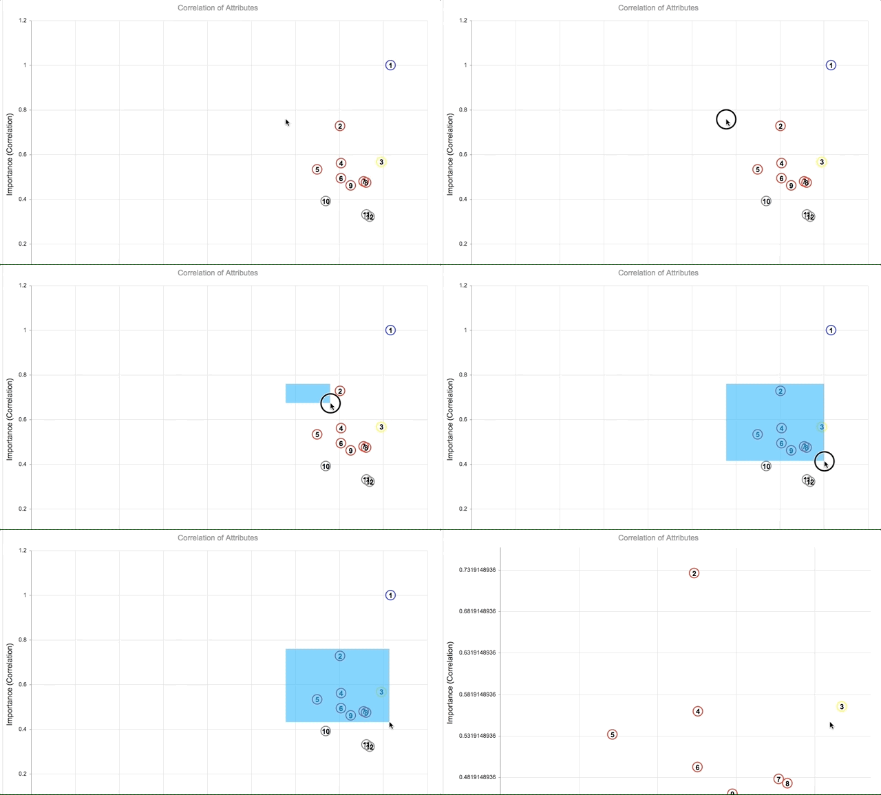
- Zoom In: Zoom in on a specific section of the chart (this is especially helpful when the chart has many data points and appears crowded):
- Click and hold down the Shift key.
- While holding the Shift key, via the trackpad or mouse, left click and select the rectangular area you wish to zoom in on.

- To see a different part of the chart during the same zoom instance, via trackpad or mouse, left click and hold to move the chart in any direction.
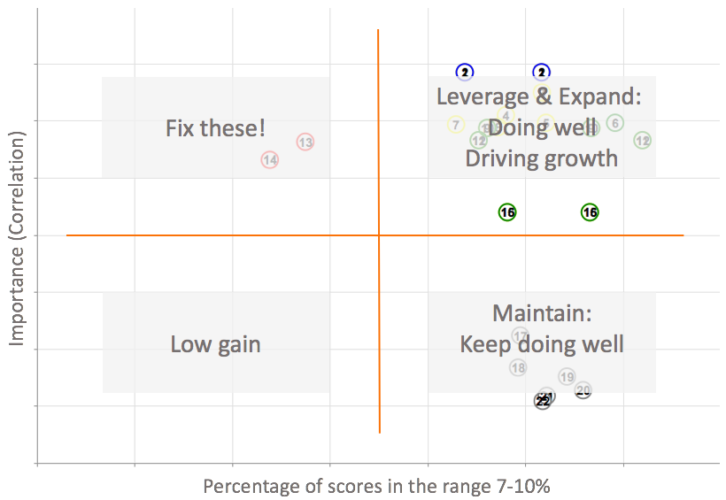
- Chart Readability: Imagine the chart split up into four quadrants

- Vertical Line: spanning from the top point, either “Recommend” or a question specified by the user (within Settings & Filters Report Settings) as point of reference for correlation, meaning it will inherently have a Correlation Coefficient of 1.00
- Horizontal Line: Goes across the chart starting at around a value of 0.5+ on the Y-axis
- Significance of Quadrants:
- Quadrant I (upper left-hand)- Fix These: Attributes that fall into this quadrant are highly correlated with a specified range of scores for a given attribute used for comparison. These are the low-hanging fruit to focus on, as scores trend lower, but addressing these areas can increase client satisfaction (if the comparison attribute is the “Recommend” question).
- Quadrant II (upper right-hand)- Leverage & Expand: Attributes that fall into this quadrant are highly correlated with a specified range of scores for a given attribute used for comparison. These are areas that your company is doing well in, exhibiting a connection with client satisfaction and scores trending higher. Customers are willing to voice what they value.
- Quadrant III (lower right-hand)- Maintain: Attributes that fall into this quadrant are NOT highly correlated with a specified range of scores for a given attribute used for comparison. However, it appears that account contacts exhibit scores trending higher. These attributes are valued by customers and are not correlated with the main attribute, but contacts pay enough attention to them in order to provide consistent feedback.
- Quadrant IV (lower left-hand)- Low Gain: Attributes that fall into this quadrant are NOT highly correlated with a specified range of scores for a given attribute used for comparison. Contacts exhibit scores trending lower, and this may signal a chance to focus on these attributes through further engagement, but with low gain. It may not be worth directing resourcing towards this area quite yet. Lower scores and lack of correlation may mean that your company is performing well elsewhere, but customers are not enthused with this Quadrant IV attributes.
- Categorization of results by color: Hovering over each attribute on the chart will display more details within a colored box.
- Green – an attribute that is high performing (falls within the right-hand quadrants) and has a correlation coefficient generally greater than .45
- Yellow – an attribute that is considered neither high or low performing as it falls within +/-5% of the Recommend attribute (or attribute chosen in Report Settings Correlation dropdown menu); also has a correlation coefficient generally greater than .45
- Red – an attribute that is low performing (falls within the left-hand quadrants) and has a correlation coefficient generally greater than .45
- Gray – a relatively low correlation coefficient (generally less than .45), regardless of where the attribute falls in terms of Performance % (any improvement is not likely to contribute towards the attribute chosen in Report Settings Correlation)
- Examples to watch for:
- Especially keep an eye out for a high number of Attributes falling into Quadrant III (lower right-hand), as this may require contact between the Account Managers and the clients, and potentially an appropriate allocation of resources from other parts of your company
- Pay attention to attributes that are related – those that appear in clusters
- For example, if you are measuring attributes in relation to “Overall Success” and also “Best Practices Advice,” then it is reasonable to expect those to appear close to each other on the chart
- If that is not the case, and the attributes are in fact apart, there is something driving each of the attributes differently, warranting a root-cause review of those attributes
To run this report:
1. Select your Settings & Filters*, including:
- Account Filters: by Accounts, Primary Product, Tier, Region, Sales Rep, Account Manager
- Contact Filters: by Contacts, Roles
- Questionnaire Filters: by Questionnaire, Wave* OR Start/End Dates*
- Question Filters: by scores relating to specific question types and attributes
*NOTE: The filter names are part of a default set and may change during implementation to better suit your company’s needs.
*NOTE: We suggest using Campaigns (“Waves”) instead of Dates for accuracy in including all Non-Responders. Waves are time periods used for sending, managing, and analyzing feedback and assessing change in customer perception over time (similar to a marketing campaign)
2. Run the report by pressing . You can save these filter settings to use across other reports by clicking the button under the “Settings & Filters” heading.
You will see:
- Chart: Correlation of Attributes
- Data Table: Question (full text), Short Question (abbreviation), Area (Touchpoint, Relationship, Overall), Responses, Correlation Coefficient, % Range (% of Responses that fall in specified Performance Range)
- By default the report is sorted by Importance Coefficient in ascending order
- Click on the column names to sort results by highest/lowest % Range, [# of] Responses, etc. Click on the column header again to change the sort direction from Ascending to Descending
- Clicking a third time will turn off sorting on that column
- You may sort by more than one column, for example, first by Responses, and then % Range, second, by clicking each column name in the order desired
3. To clear the filter set, make sure to do so by clicking on the icon under the “Settings & Filters” heading.
4. To download your reports:
- Correlation of Attributes chart:
- Export as image by clicking on the icon and “Export Image”
- Export as a PDF by clicking on the same icon and “Export PDF”
- Data Table:
