
Table of Contents
Getting the most out of the report
Examples to watch for
Run report and filter settings
Save report settings
Erase filter set
Download report
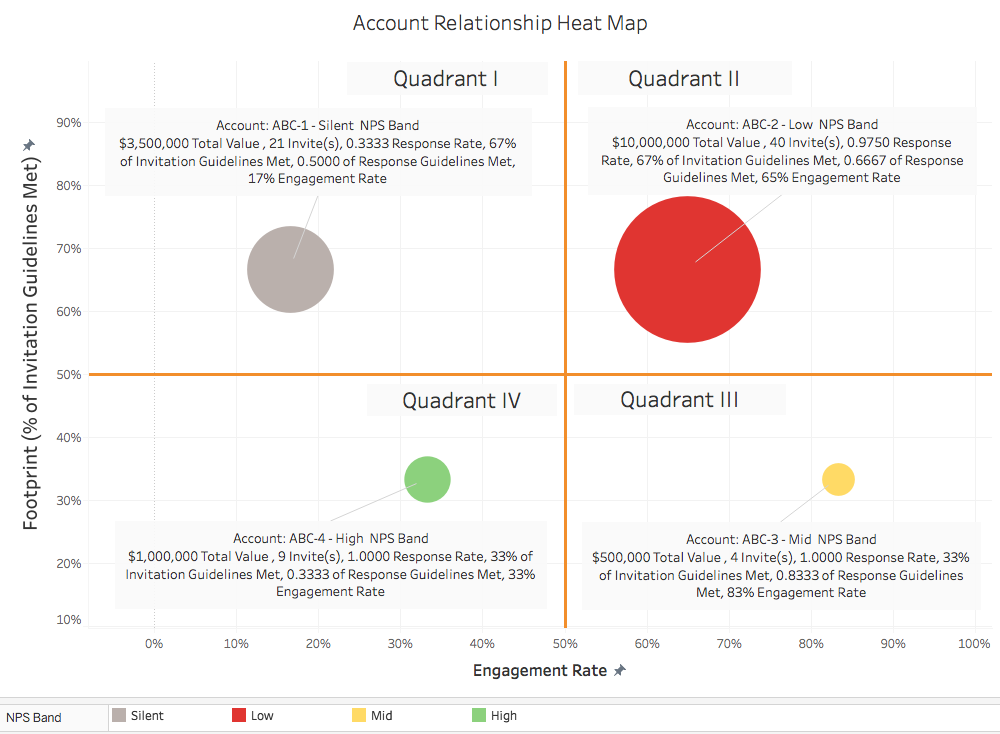
Understand strength of relationships for specific accounts, related revenue, and sentiment
Why you need this report: to help identify the right sales/account-management plays for each account.
- Review the strength of customer relationships through response rates and NPS (sentiment of the account)
- Identify valuable accounts with low response rates, which may provide an early signal of churn potential
- Non-responders are generally worse than detractors: engage the account teams to be able to identify and recruit the right contacts
- Utilize filters to zoom in on specific accounts, waves, segments
Getting the most out of the report:
The Customer Heat Map report shows the “account footprint,” or the strength of relationships with the right people, in comparison with revenue and sentiment.
- X-axis (horizontal) = Engagement = (% of Response Guidelines Met) * ( Response Rate for the Account)
- Accounts that are meeting Response Guidelines will appear farther to the right on the X-axis
- Response Guidelines are determined during TopBox implementation to set thresholds for the number of contacts providing feedback for each role
- % of Response Guidelines Met is multiplied by the overall Response Rate for the Account
- Weights using Response Rate are assigned in order to account for lower or higher response rates
- For example:
- Account ABC has Response Guidelines of 2 respondents identified as Decision-Makers, 2 respondents identified as Key Influencers, 2 respondents identified as Day-to-Day, and Response Rate of 75%
- If the Response Guidelines are met fully, meaning that 2 contacts for each of the three roles provided feedback, then the Account ABC circle will appear at the 75% mark on the X-axis; (6/6)*0.75 = 0.75
- If the Response Guidelines are met partially, and 2 contacts identified as Decision-Makers provided feedback (with only 1 respondent identified as a Key Influencer and 1 respondent identified as a Day-to-Day user), then the Engagement level would be 25% on the X-axis; (2/6)*0.75 = 0.25
- Note: For a more accurate understanding of engagement on behalf of those contacts impacting buying decisions, filter OUT the Day to Day users to show only Influencers and Decision Makers
- Y-axis (vertical) = Footprint (% of Invitation Guidelines Met)
- Generally, accounts with larger footprint should have more contacts invited
- Invitation Guidelines are determined during TopBox implementation to set thresholds for the number of contacts invited to provide feedback for each role within accounts
- For example:
- Account ABC has Invitation Guidelines of 4 contacts identified as Decision-Makers, 4 contacts identified as Key Influencers, 4 contacts identified as Day-to-Day
- If the Invitation Guidelines are met fully, meaning that 4 contacts for each of the three roles were invited to provide feedback, then the Account ABC circle will appear at the 100% mark (all the way at the top) on the Y-axis
- If the Invitation Guidelines are met partially, and 4 contacts identified as Decision-Makers were invited to provide feedback (with only 2 contacts identified as Key Influencers and 3 contacts identified as Day-to-Day users), then the % of Invitation Guidelines Met (footprint) would be 33% on the Y-axis
- Account Relationship Heat Map placement: Combining both the Footprint and Engagement % of Guidelines Met
- Accounts that appear in the upper right-hand quadrant of the heat map are performing well in terms of meeting both Invitation and Response Guidelines
- Accounts that appear in the lower left-hand quadrant of the heat map are performing poorly in terms of meeting both Invitation and Response Guidelines. In this case, engage the account teams to be able to identify and recruit the right contacts to provide feedback during future questionnaire waves.
- Significance of quadrants [where account circles show up]:
- Upper left-hand quadrant: Actively recruited, but disengaged
- Upper right-hand quadrant: Actively recruited and engaged
- Lower left-hand quadrant: Requires more active recruiting, and disengaged
- Lower right-hand quadrant: Requires more active recruiting, but is engaged
- Circle Size = Account Value
- Larger circles indicate a higher account value
- Larger circles typically indicate higher engagement, as contacts took the time to provide feedback
- Higher engagement could be the product of “Active Recruiting” efforts led by your account managers to engage the right contacts and acquire feedback
- Circle Color = Account Sentiment
- Determined by the NPS for the account
- Green = Mostly positive sentiment (more promoters than passive or detractors)
- Red = Generally negative sentiment (more detractors than passive or promoters)
- Yellow = Neutral sentiment (detractors, passive, and promoters even each other out)
- Gray = Completely silent account (giant red flag as none of the contacts provided feedback to improve their own experience or share satisfaction)
Examples to watch for:
- Large accounts with strong relationships could signal an “expansion” opportunity, while accounts with a small-footprint that are unhappy signal revenue at risk and likely need engagement
- A small Red or Gray bubble in the upper right quadrant:
- This shows a very “thin” relationship with a customer that is very valuable to the firm: many contacts were invited, few (or none) responded, and those that might have responded are unhappy
- These could represent revenue at risk
- A large Green or Yellow bubble in the upper left corner:
- This shows a strong relationship (large number of contacts with high response rate and positive sentiment) with an account that is currently not spending as much as the other accounts included in your filters
- These could be good cross-sell/up-sell opportunities
To run this report:
1. Select your Settings & Filters*, including:
- Account Filters: by Accounts, Tier, Region, Sales Rep, Account Manager, Industry
- Contact Filters: by Contacts and Role
- Note: All contacts by role are included in the report – to filter OUT Day to Day contacts, select Decision Makers and Influencers
- Questionnaire Filters: by Questionnaire, Wave OR Start/End Dates*
*NOTE: The filter names are part of a default set and may change during implementation to better suit your company’s needs.
*NOTE: We suggest using Campaigns (“Waves”) instead of Dates for accuracy in including all Non-Responders. Waves are time periods used for sending, managing, and analyzing feedback and assessing change in customer perception over time (similar to a marketing campaign)
2. Run the report by pressing . You can save these filter settings to use across other reports by clicking the button under the “Settings & Filters” heading.
You will see:
- Account Relationship Heat Map: Each circle displayed corresponds to an account:
- Color-coded depending on the Net Promoter Score for the account
- Size of the circle corresponds to the account value
- Accounts with more “spend” with your firm will be represented by larger circle
- X-axis (horizontal) shows Engagement level for that account
- Accounts meeting Response Guidelines with higher Response Rates will appear farther to the right on the axis
- Y-axis (vertical) shows the footprint via the number of contacts that were invited from the account
- Accounts with more invited contacts will appear higher on the axis
- Data Table: Accounts (that were invited to provide feedback), Tier, Wave, Account Managers, # of Contacts Invited, Account Value ($), Response Rates, NPS Score, and NPS Band per account
- By default the report is sorted alphabetically by Account Name
- Click on the column names to sort results by highest/lowest Response Rate, NPS, etc. Click on the column header again to change the sort direction from Ascending to Descending. Clicking a third time will turn off sorting on that column.
- You may sort by more than one column, for example, by Account Value first, and then Response Rate, second, by clicking each column name in the order desired.
- Click on the Account Name to see the X-Ray report (in a new tab) for deeper insights into overall health of the account relationship.
3. To clear the filter set, make sure to do so by clicking on the icon under the “Settings & Filters” heading.
4. To download your reports:
- Customer Heat Map:
- Export as image by clicking on the icon and “Export Image”
- Export as a PDF by clicking on the same icon and “Export PDF”
- Data Table:
- Export as Excel file by clicking on the
 icon on the gray banner