
We have been very busy over the last 8 months and we neglected to update you regarding all the exciting new features that TopBox has to offer! Here is a rundown of everything we have recently accomplished.
Below you will find detailed information about how TopBox has improved. For now, please keep the feedback coming as we continue to improve our platform to provide actionable insights for your business!
HIGHLIGHTS
NEW REPORTS
Ratings by Question
Response Frequency
UPDATED REPORTS
Customer Heat Map
Benchmark Report
NEW FEATURES
Expanded integration capabilities with Salesforce
Settings & Filters: “Group By” functionality expanded on with “Second Group By”
New Questionnaire Type: URL variable questionnaires
Security Enhancements
Questionnaire level opt out for invited contacts choosing to unsubscribe
Improved deliverability and security
Chart type toggle for Followups and Comment Analysis charts
In line editing now available in Comment Analysis data table
SQUASHED BUGS
Double-byte characters are now showing correctly in various charts
Cascading filters fixed
Newly Created Tags not showing up in the Comment Analysis report
NEW REPORTS
Ratings by Question
Why did we develop this report and why is it useful?
- The Ratings by Question report allows you to see results for each of the specific rating questions grouped by wave, account, segment, and other criteria.
- You can view the percentage of ratings that meet your performance target, the average score, and the net score for each question.
- The results are grouped by Questionnaire by default, but can also be grouped by a variety of criteria by using the “Group By” functionality (described in more detail in the New Features section below).
- The report can be found in the main menu under Reports > Top Line.
- For a more detailed explanation about the Ratings by Question report, including instructions, please check out the help document at: https://topboxtech.com/response-frequency-summary-instructions/
- As a reminder, the instructions document for any report can be found by clicking the blue “i” icon below the name of any TopBox report.
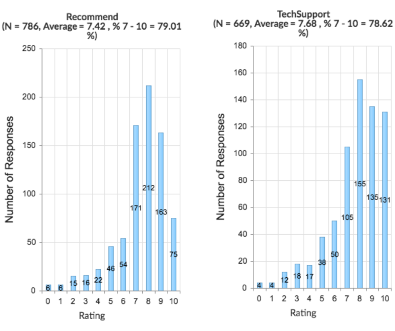
Response Frequency
Why did we develop this report and why is it useful?
- The Response Frequency report provides a question-by-question breakdown of each response to the rating questions included in your questionnaire. This report complements the Key Driver Correlation report by providing insights into what is scoring high and low by any segment you choose, to align resources and improvement plans with strategy and customer expectations.
- Use the histograms for each rating question to easily visualize the skew in the ratings (answers):
- Are scores generally skewed in one direction or the other?
- Are scores normally distributed as a bell curve?
- Identify which rating questions exhibit the highest or lowest percentage of scores within the performance range (set to 7-10 by default and can change during implementation to better suit your company’s needs):
- In what areas do your customers think you are doing well or need to improve in?
- The report also provides Net Scores for each rating – Net Score = (% of 9-10 scores) – (% of 0-6 scores)
UPDATED REPORTS
Customer Heat Map: Revised Heat Map
Why is this report valuable?
The Customer Heat Map shows a map of each account to highlight the appropriate action needed to capitalize on the feedback from a given account.
- Review the strength of customer relationships through participation and NPS (sentiment of the account).
- Examining participation rates helps highlight the level of engagement, which is especially valuable following active recruiting and commitments to follow up.
- Identify valuable accounts with low response rates, which may provide an early signal of churn potential.
What improvements were made and why?
We changed the Account Relationship Heat Map to more accurately reflect response rates, account revenue, and sentiment.
X-axis (horizontal) – Engagement calculation has changed:
- % of Participation (Response) Guidelines Met is multiplied by the overall Participation (Response) Rate for the Account.
- Weights using Participation (Response) Rate are assigned in order to account for lower or higher response rates.
- This ensures that accounts with low response rates do not outperform more engaged accounts, regardless of the minimum Response Guidelines Met (determined during TopBox implementation).
- As a result, silent accounts will now always appear on the far left side of the heat map at a 0% Engagement rate.
How to read the heat map?
- Accounts that appear in the upper right-hand quadrant of the heat map are performing well in terms of meeting both Invitation and Response Guidelines
- Accounts that appear in the lower left-hand quadrant of the heat map are performing poorly in terms of meeting both Invitation and Response Guidelines. In this case, engage the account teams to be able to identify and recruit the right contacts to provide feedback during future questionnaire waves.
- Significance of quadrants [where account circles show up]:
- Upper left-hand quadrant: Contacts identified for a stronger footprint, but disengaged.
- Recommended action: Rework processes to further engage the accounts, as accounts in this quadrant are at high risk of churn.
- Upper right-hand quadrant: Actively recruited and engaged.
- Recommended action: Work on expansion opportunities.
- Lower left-hand quadrant: Weak footprint, and disengaged.
- Recommended action: Accounts in this quadrant are at the highest risk of churn and should be prioritized for outreach by the executives.
- Lower right-hand quadrant: Requires more active recruiting, but is engaged.
- Recommended action: Leverage existing relationships to meet new contacts and grow the footprint.
- Upper left-hand quadrant: Contacts identified for a stronger footprint, but disengaged.
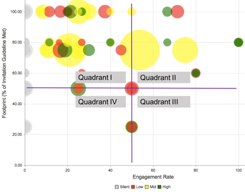
Note: Circle size is still determined by Account Value ($) and circle color relates to NPS band:
- Green = Mostly positive sentiment (more promoters than passive or detractors)
- Red = Generally negative sentiment (more detractors than passive or promoters)
- Yellow = Neutral sentiment (detractors, passive, and promoters even each other out)
- Gray = Completely silent account (giant red flag as none of the contacts provided feedback to improve their own experience or share satisfaction)
Benchmark Report: “Group By” function is now “Benchmark By” and “Benchmark Value”
Why is this report valuable?
The Benchmark report enables you to examine how a specific segment is performing against other segments. See how a particular questionnaire wave or benchmark category and benchmark value compare to other waves or categories, respectively, in terms of attribute scores.
What improvements were made and why?
- The “Benchmark By” function shows you which areas of the business are working well or not working well. By utilizing the Key Driver Benchmark, you can further highlight the differences between the segments.
- This report provides a point of reference by setting a “Benchmark By” category and a specific benchmark value, which are set by the user through Report Settings.
- For example, you can “Benchmark By” Industry and set the “Benchmark Value” to Financial Services to see how all other industries compare to Financial Services, in terms of attribute scores.
- Set a minimum score standard to understand what percentage of responses meet the specified range (of scores for a variety of attributes).

NEW FEATURES
Expanded integration capabilities with Salesforce
Why did we develop this report and why is it useful?
The largest investment over the last few months has been improving the two-way integration with Salesforce.
- Inbound: We can now automatically receive triggers from Salesforce in order to create contacts and send invitations in TopBox. For example, we have the ability to send surveys to specific contacts (that exist in Salesforce) based on various triggers, such as closing a tech support case, three months after onboarding, the close of a new deal, etc. If the data exists in Salesforce we have the mechanism to ensure that the right feedback can be collected at the right time.
- Outbound: We have extended our ability to work with any object in Salesforce aside from just the account and contact objects. This means that we can work with standard objects, such as opportunities, and even custom objects, such as “feedback” that would maintain feedback history for the contact within Salesforce.
Settings & Filters: “Group By” functionality expanded on with “Second Group By”
Which TopBox reports utilize these features?
“Group By” and “Second Group By” are found in Settings & Filters under the Report Settings section in the Summary Results report.
Why are we developing this feature and why is it useful?
- The “Group By” function allows you to segment report results by account and contact level metadata provided for import into TopBox. By using “Second Group By,” you can drill down even further.
- By default, Summary Results is grouped by Questionnaire Wave and shows NPS results across waves, but there are other ways to view the results.
- For example (depending on what attributes you have enabled for your TopBox instance), you can use the “Group By” function to compare NPS results across various Regions.
- In addition, you may be interested to know how the results compare across industries in those regions. Selecting Industry in the “Second Group By” dropdown list would enable you to do that.
- Helpful note: You may have a lengthy list of Regions and Industries, or any other metadata, which could cause the charts to get a bit crowded. For the example above, it may be useful to use Filters to exclude certain Regions or Industries.

New Questionnaire Type: URL variable questionnaires
Why are we developing this feature and why is it useful?
- URL variable questionnaires allow for passing data, prepopulating questionnaires, and storing and reporting data in TopBox and other systems.
- In the past we only had the ability to use encrypted URLs for questionnaires. Now, questionnaires with URL Variables are embeddable in online systems, within your product, or other situations where you want to collect and analyze feedback without encrypting and generating personalized URLs in advance.
- Custom fields have been redesigned and now enable dynamic creation and mapping of many custom fields and pass through URL variables.
Security Enhancements
Why are we developing this feature and why is it useful?
- We now have the ability to create a variety of custom Roles and assign custom permissions for TopBox users.
- This means that users assigned to specific Roles can be limited to viewing results for a specific set of accounts and questionnaires.
- Any number of people can be automatically provisioned to view only the designated accounts. This updates the feature that previously enabled auto creation for only one person.
Questionnaire level opt out for invited contacts choosing to unsubscribe
Why are we developing this feature and why is it useful?
- In the past unsubscribe links only allowed for client level opt out, which meant that invited contacts unsubscribed from future questionnaires.
- This new feature enables questionnaire level opt out, so the same invited contacts would still receive invitations for future questionnaires.
Improved deliverability and security
Why are we developing this feature and why is it useful?
Deliverability: We have added DKIM settings for improved email deliverability and security, and TopBox no longer relies on simple SPF records. Your IT department will be happy with this more-secure and modern solution
Security: We have enhanced our TopBox user security system, allowing you to more easily create user-roles that fit your business to facilitate security and ease-of-use.
- For example, you can create a “Field Sales” role that would display only the parts of TopBox appropriate to that role, while also restricting data visibility to “my accounts” that will not display data that would be superfluous to that user.
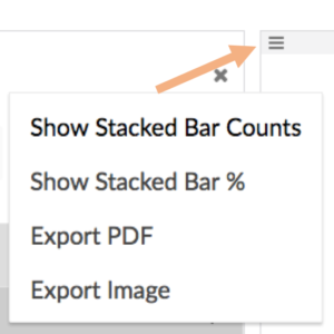
Chart type toggle for Followups and Comment Analysis charts
Why are we developing this feature and why is it useful?
Now you have the ability to toggle between “Stacked Bar Counts” and “Stacked Bar %” using the chart menu for Follows and Comment Analysis charts.
Followups: The x-axis of the chart shows the percentage of alerts responses for each tone category.
- For example, 50% of followup alerts for a specific category could be tagged as being positive and the remainder 50% are tagged as neutral.
- By using the chart menu, you could change the chart type to “Stacked Bar Counts,” which would show a distinct count instead of the percentage.
Comment Analysis: The x-axis of the chart shows the percentage of tagged comments for each comment category.
- For example, 50% of comments are tagged as positive for comments relating to “Product” and the remainder 50% are tagged as neutral.
- By using the chart menu, you could change the chart type to “Stacked Bar Counts,” which would show a distinct count instead of the percentage.
In line editing now available in Comment Analysis data table
Why are we developing this feature and why is it useful?
- You now have the ability to edit the “Translation/Notes,” “Tone,” and “Tags” fields right within the data table (list of contacts who included Comments in their responses).
- Prior to this feature, the user had to click on a respondent and make edits in a separate window.
SQUASHED BUGS
Double-byte characters are now showing correctly in various charts
What was the bug and results of the fix?
In the past we had issues with double-byte characters not showing up correctly in charts from various reports. For example, any data originally provided in Kanji (a type of Japanese writing system) does not pose any issues related to readability in report charts.
Cascading filters fixed
What was the bug and results of the fix?
When making a selection in certain filters, content in other filters dropdown lists should automatically adjust. For example, after navigating to Settings & Filters > Questionnaire Filters and selecting a specific questionnaire, Account Filters and Contact Filters should only reflect those accounts and contacts that were actually invited to participate.
What was the bug and results of the fix?
We experienced issues with newly created Tags not showing up in the Comment Analysis report. This means that a user was not able to Tag a comment with a new Tag created via the Administration > Tags section of TopBox. This is no longer an issue and Comment tagging has been streamlined by enabling you to select Tags in the Comment Analysis report right from the data table (described above in the New Features section).